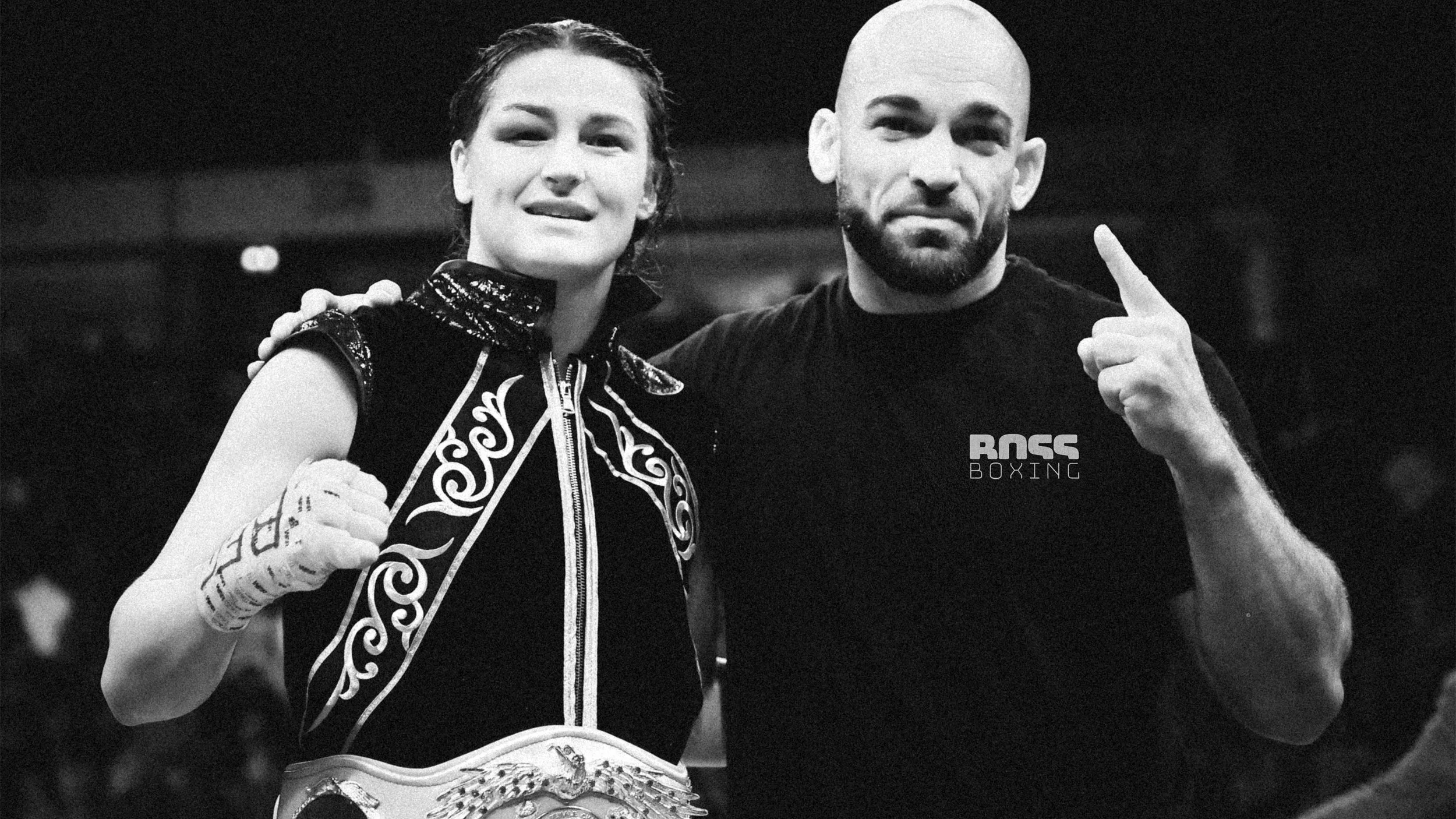
ROSS BOXING
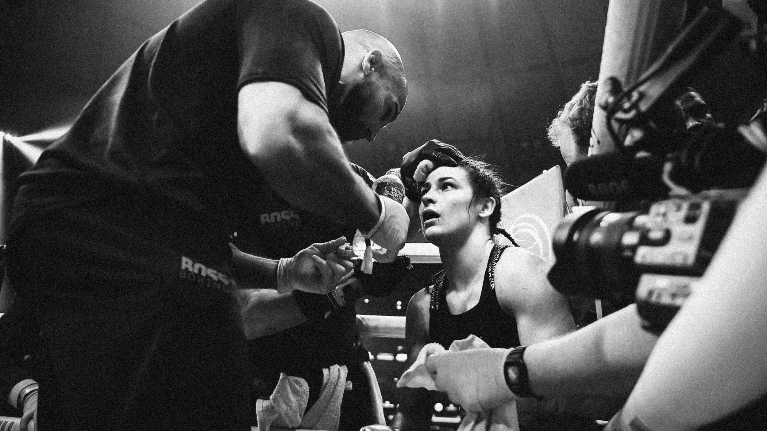
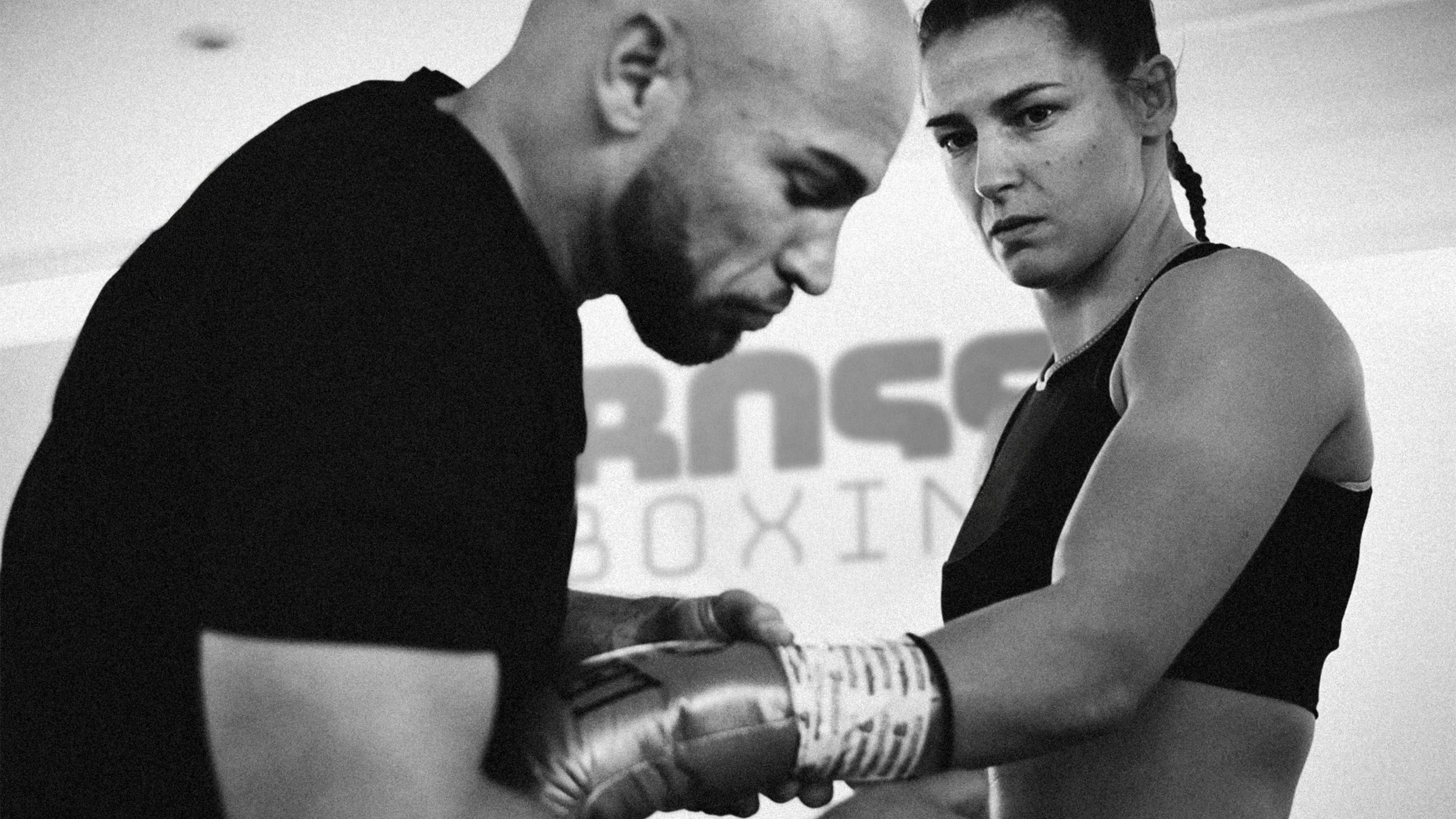
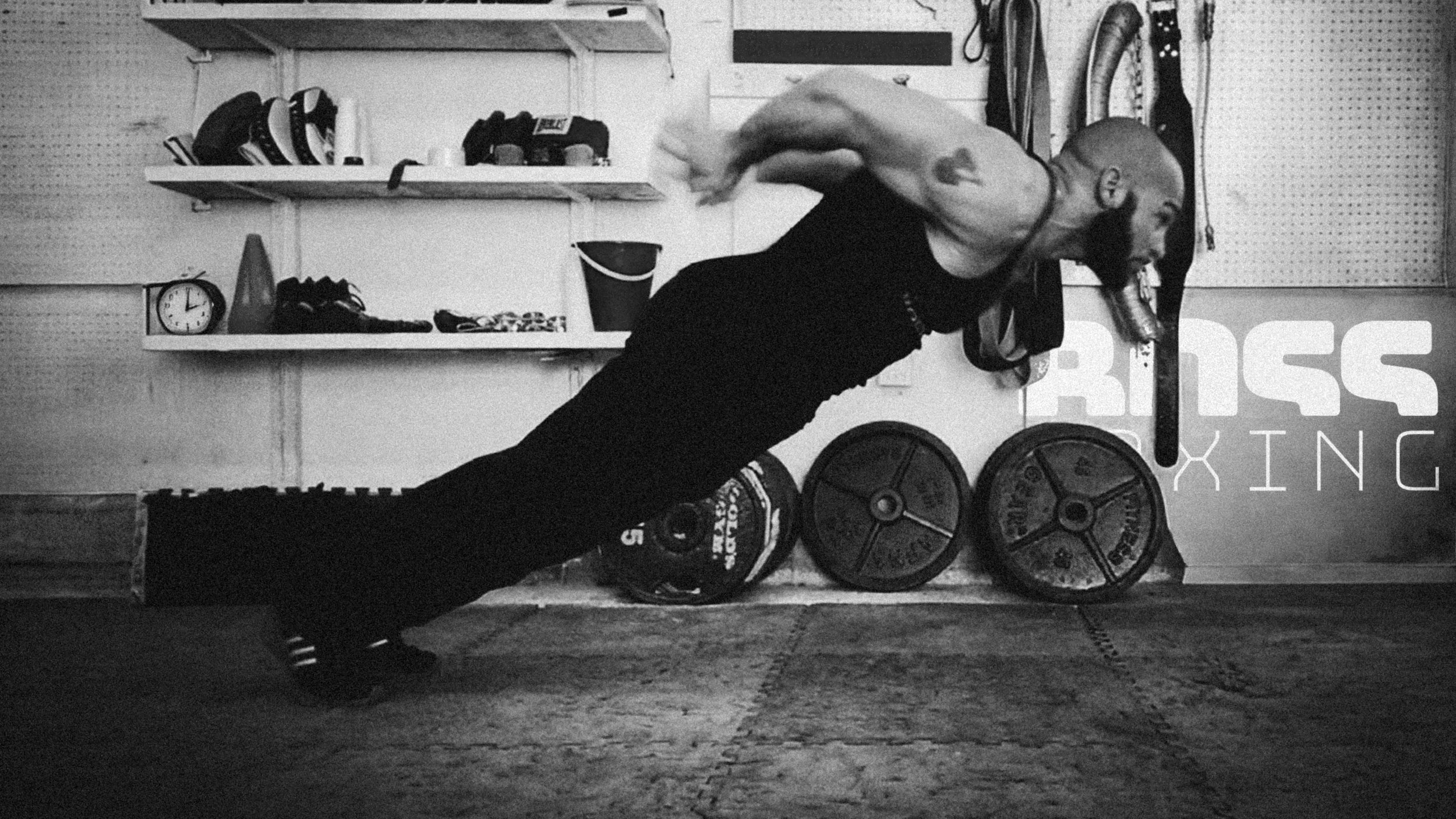
Ross is the O.G. influencer—a trainer who builds world champions in a garage. But his visual identity didn't reflect that premium grit. It looked homemade. He deserved a brand that hit as hard as his fighters.
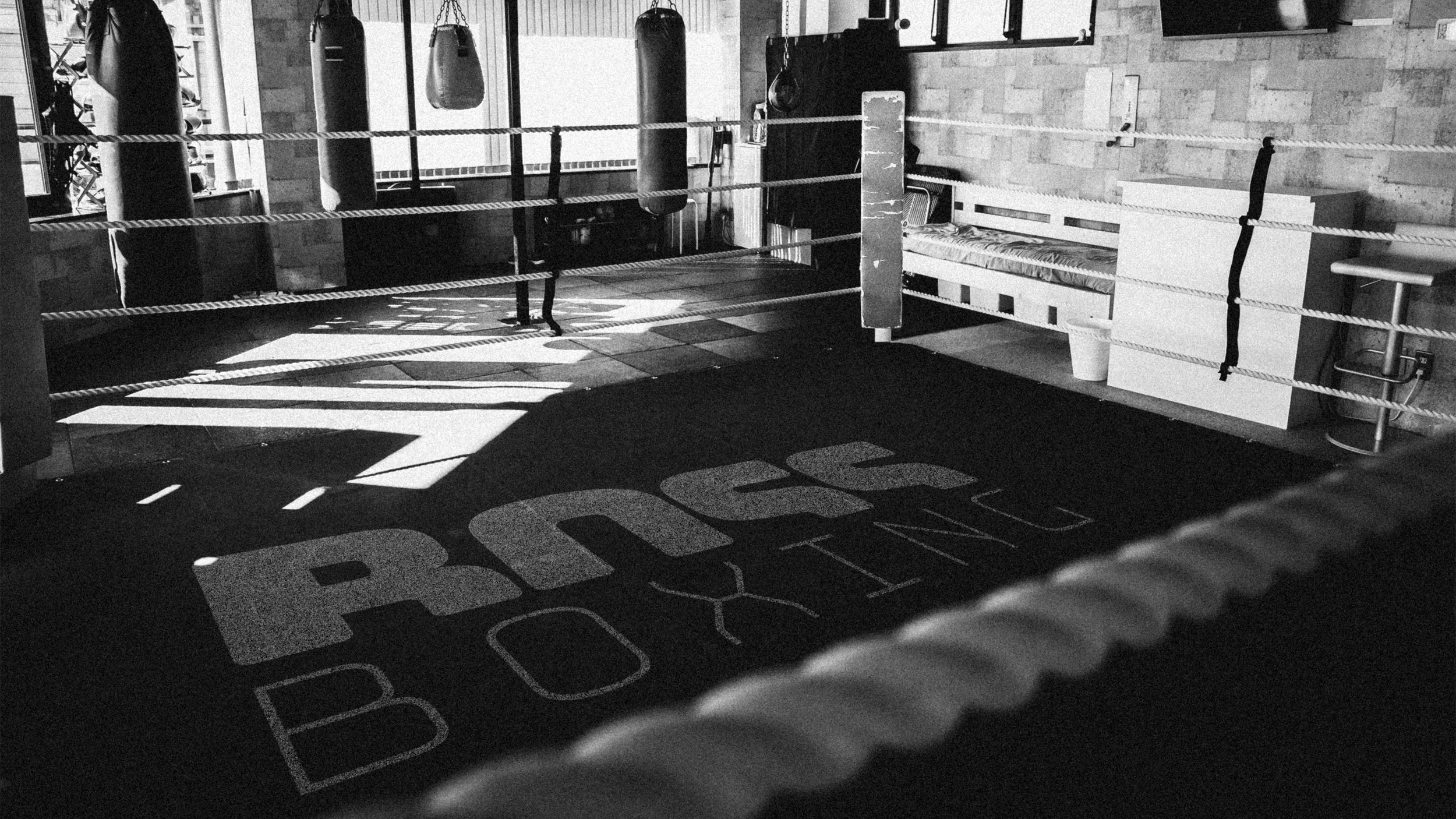
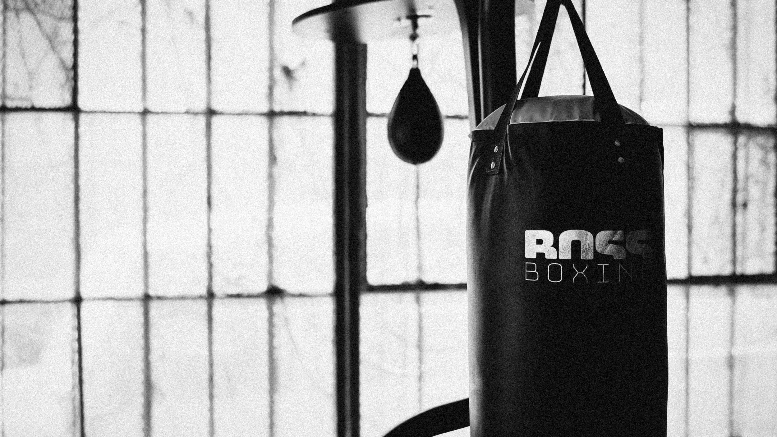
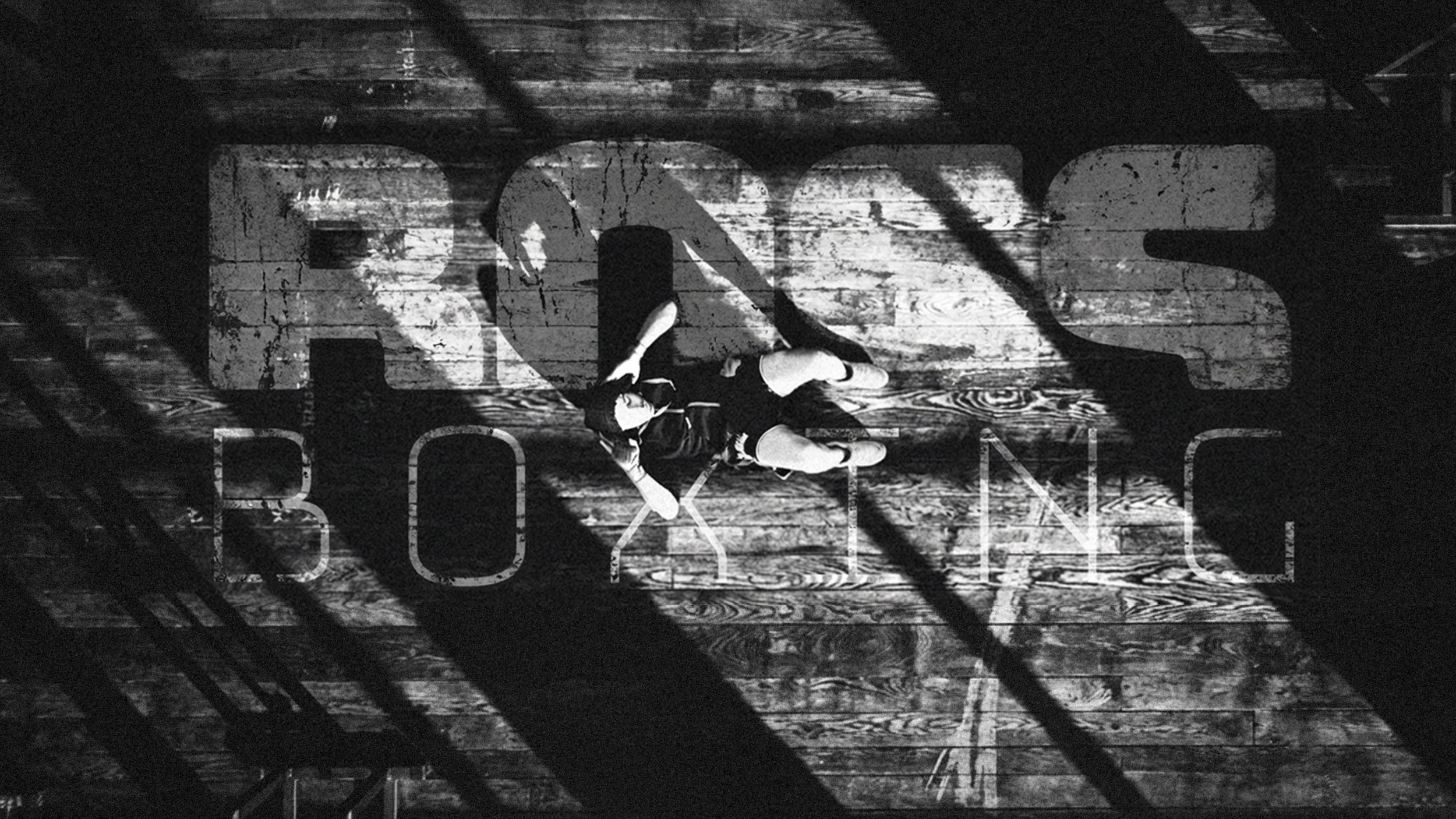
I wanted to capture the duality of the man: Humble but dangerous. The logo features a typographic trick—a "false crop" on the bottom of the name "ROSS" that allows the eye to read it as either ROSS or BOSS. It’s subtle, structural, and undeniable. Placed on a heavy bag or a canvas floor, it looks like it’s always been there.
A personal project born out of respect. I wanted to see if I could elevate a "garage gym" aesthetic without losing the sweat. The result is a brand system that is simple, direct, and effective. Just like Ross.