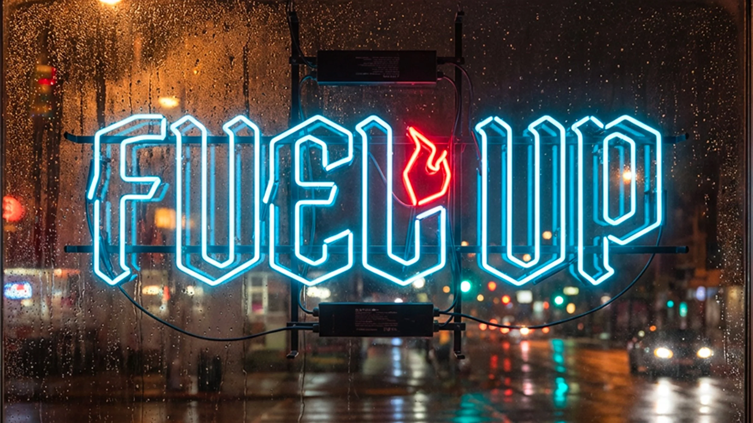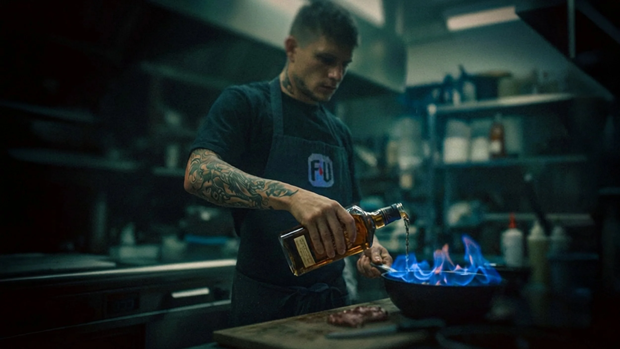
FUEL UP
Most "retro" diners feel like a costume party. I wanted to build a brand for a place that smells like gasoline and bacon. A place that doesn't apologize.
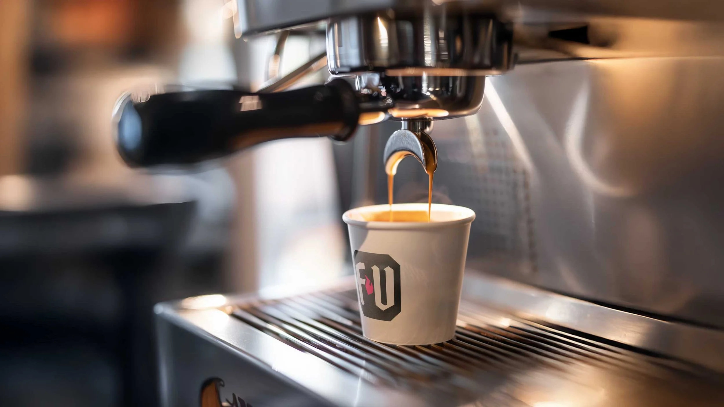
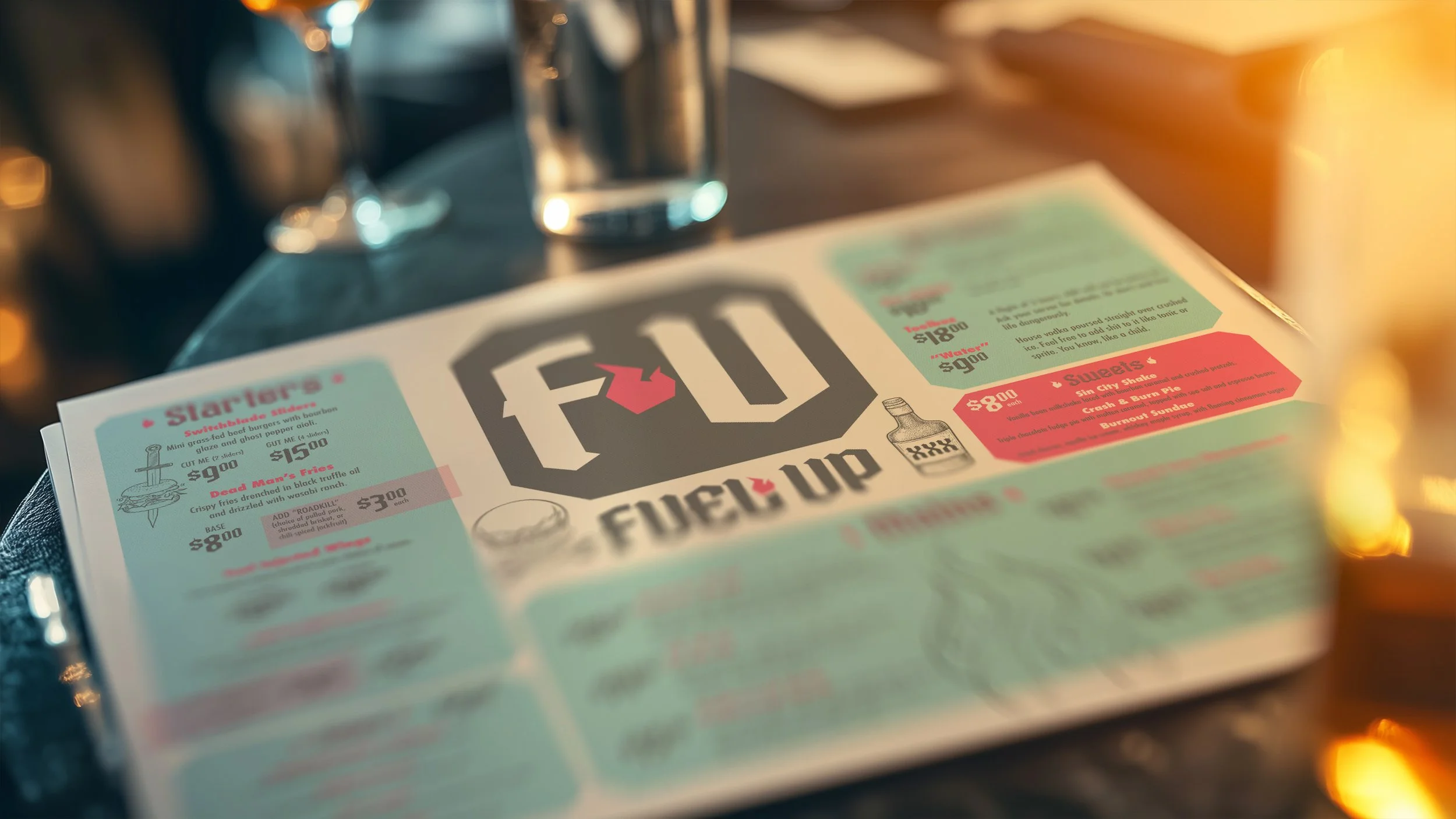
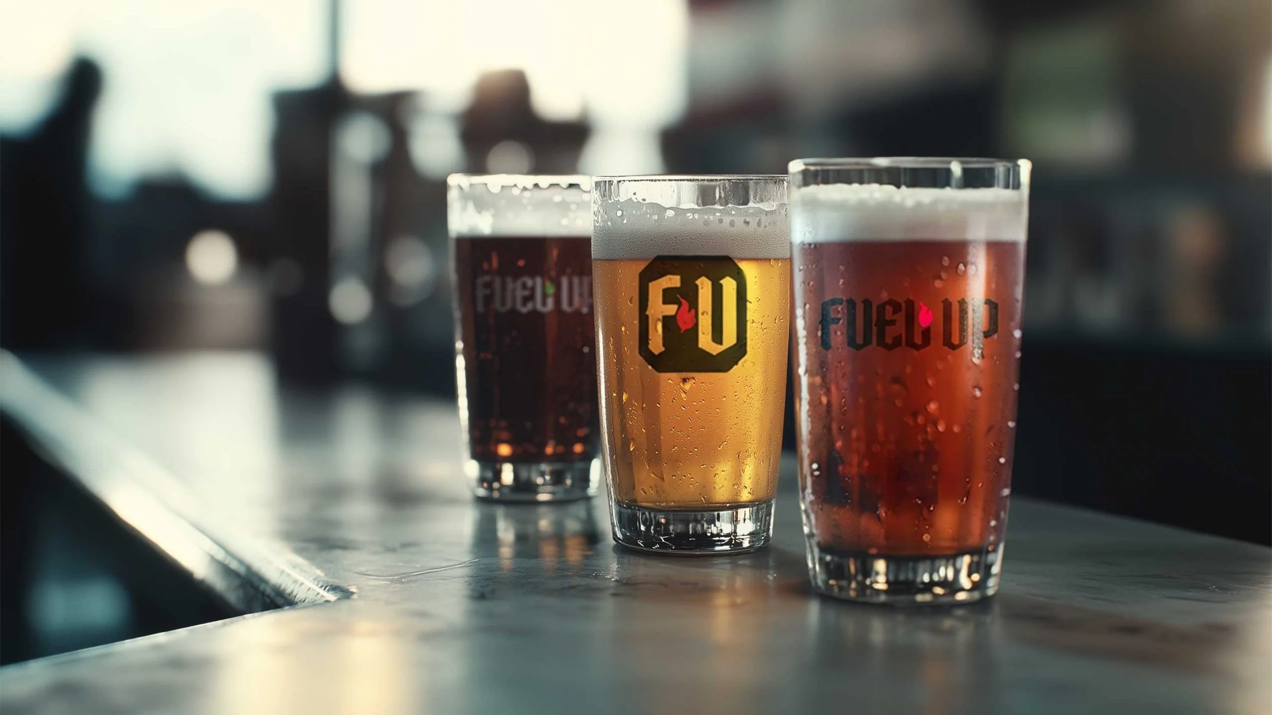
The name gave it away: Fuel Up = F.U. I leaned into that aggression. The identity is built on 50s moto-culture, tattoo flashes, and neon. The cutlery isn't just silverware; it’s designed to look like butterfly knives. The logo on the espresso cup is a shot of caffeine and adrenaline.
This is uncompromised design. No committees, no "make the logo bigger," just a perfect blend of polish and punk rock. Designed to bleed beautifully.